MGM Rewards
Loyalty Platform Evolution
THE CHALLENGE
Improve the Loyalty Customer Experience
How might we integrate research insights to simplify our platform, align it with our brand's excitement, and enhance the customer experience to drive deeper engagement?
Contribution
Duration
Platform
Design Director
Three Months
Mobile App
Web


Before/After - Drag Handle to View
Introduction
In 2021, MGM Resorts Intl. built a new digital loyalty platform, and just two years later in 2023, it’s clear through data and customer feedback significant changes must be made to improve the customer experience.
- New customers to the program had difficulty understanding the difference between “Loyalty Points” and “Tier Credits.”
- Customers across all membership tiers had difficulty tracking their progress while on a trip - a key part of their journey as rewards members.
- Customers were unclear exactly what their points could get them, though general content existed to explain the value of the program.
- The digital experience was growing as we added new features, and we needed to improve the information architecture to align it across the mobile and web experience.
Research & Validation
Evolved to Empower Customers for the Future
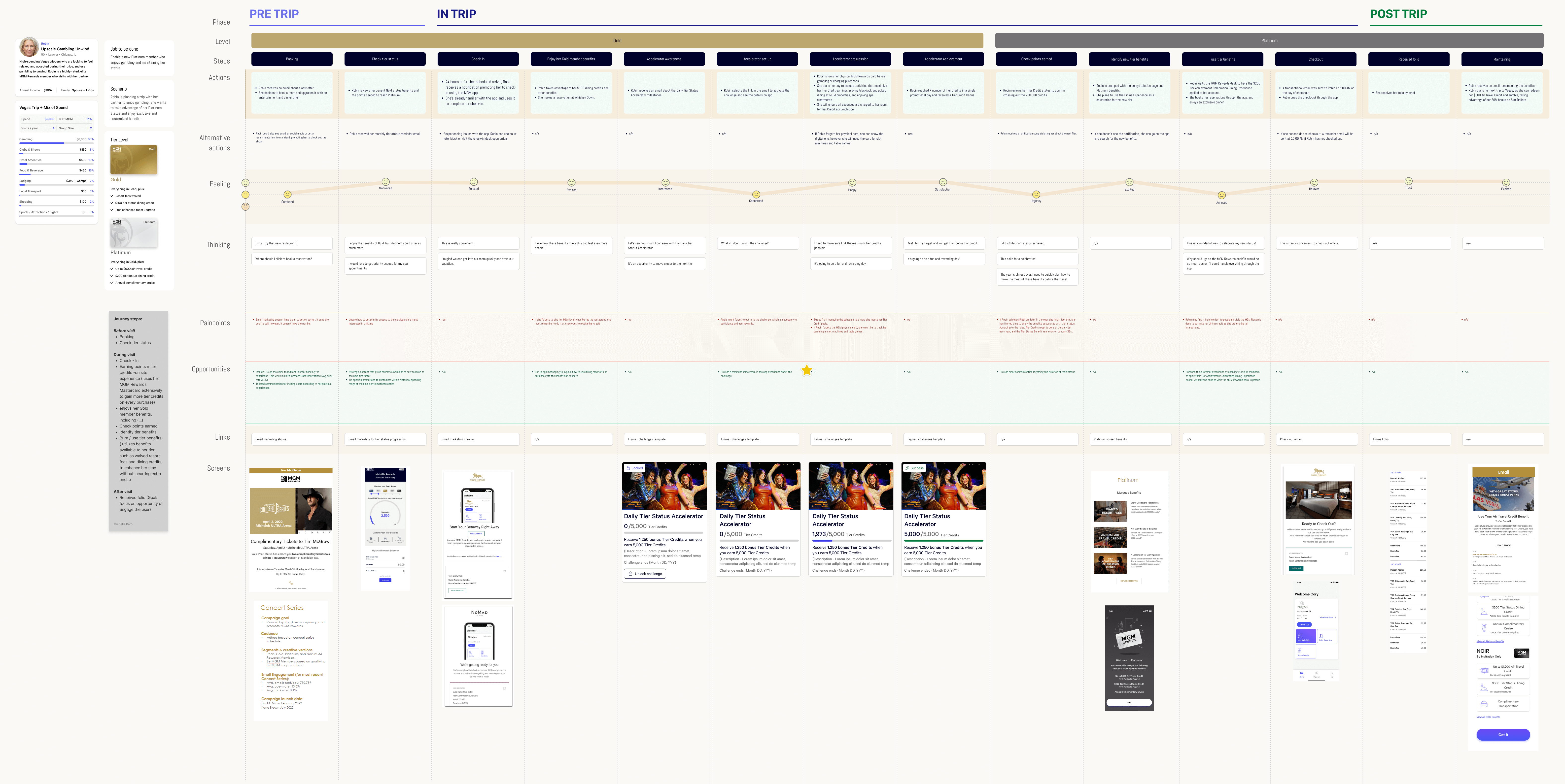
I led the end-to-end product design process and team of UX and Visual Product Designers, UX Researchers, and a Content Strategist. We created journey maps for our four key program tiers to identify gaps, pain-points, and potential wins across the primary stages of the customer journey — pre-trip, in-trip, and post-trip.
We prepared a competitive analysis of Las Vegas area hospitality brands as well as broader loyalty programs in the hospitality and travel industry, and confirmed our Activity Summary feature would set a new standard for Las Vegas brands.
We conducted moderated and unmoderated usability studies throughout the design process at progressively higher levels of fidelity to validate the success of our new design direction.
We completely overhauled the content strategy to improve program clarity, add personalization, and increase program engagement - key customer problems to solve.
Usability Testing Summary Findings
Key Insights
Improve Program Clarity, Focused on Valuable Engaged Members
Customers struggled to notice the difference between Loyalty Points and Tier Credits. We needed a solution that helped visualize their differences, and prioritize Tier Credits as the primary benefit. Encouraging customers to advance to higher tiers means longer and higher engagement with the program.
Our higher tier customers (Gold+) were important to the business. In many cases they were active gamers who spent much of their time and money at gaming tables. Though they already used our mobile app during their trip, they were missing key information detailing their points earned as they gamed toward the next higher tier. They would instead wait in line to visit the Rewards Desk to check on their progress. We needed to empower them with the information in their app while reducing the burden on Member Desks inside the casino.
Additionally, our recently launched gamification strategy wasn’t seeing the engagement our business had forecast, and we needed to improve our approach.

Iterating on the Mobile Web Design - Key Considerations for the IA
In-person Gamification Workshop
Process
Pilot Release
Our plan was to focus on a limited percentage of higher tier customers in our rollout of the redesign. These customers were already familiar with the program, and actively engaged.
- At early stages of the effort, we were focused on understanding existing insights from qual and quant data, as well as improving the content strategy to personalize more details regarding redemption, and further clarify the differences between points and credits.
- I proposed that we support new features already on the product roadmap in both the redesigned and existing experience (creating some design debt), to allow some features to roll out in the existing design sooner.
- I aligned with my Product and Engineering leadership on our rollout plan to test the success of the new experience with our more valuable customers in higher tiers.
One unexpected insight we found: while testing our initial design of the new “activity summary” feature, we found participants still didn’t see a strong enough division between loyalty points and rewards tiers. They saw them as interchangeable.
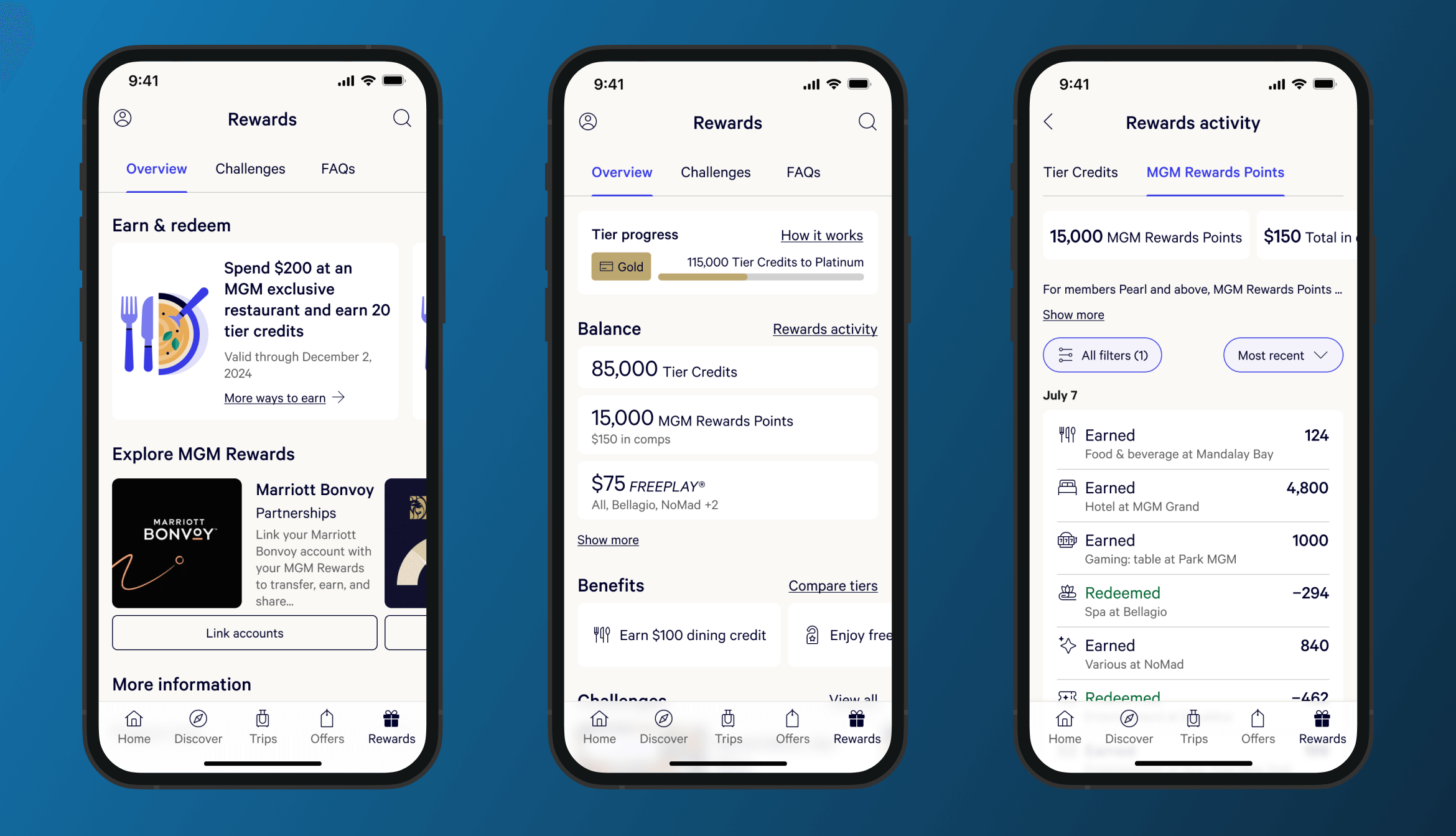
I proposed a new design which divided the listing of activity into separate tabs for Tier Credits and Rewards Points, with additional detail describing each. We re-tested the new version and confirmed customers clearly understood the different value systems.
Solution
Improved Clarity, More Details, and a Modern Design
The redesigned experience accomplished our main goals for the project:
- Improved program clarity - creating more intentional differentiation between the points systems
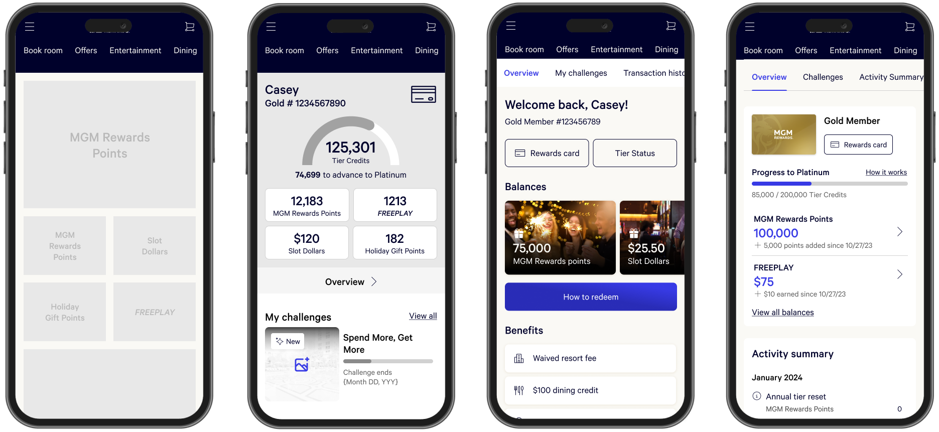
- Released a major new feature "Activity Summary" which allowed customers to track their progress in the program from their app
- Improved our “gamification” promotions program experience - with our strategy for more compelling future promotions, as well as reduced friction to begin a promotion, and better visual indicators of progress through the promotion
- Significantly improved the information architecture and visual design across the platform to allow for future program expansion
Final Designs for App, Mobile Web, & Desktop Web
Metrics
Impact
+6.8%
Growth in engagement for Gold+ Members; Month Preceding engagement: 2.4%
+$3.5MM
45 day increased incremental revenue; 6-month target: $5-10MM
+9%
Growth in points redemption rate
+572K
Visits to Activity Summary Feature; (86% of total visits to Loyalty Overview screen)
Reflections
Balancing Existing Commitments, and Limited Release
One of the most challenging aspects of this project was designing the overall experience in the new design, while simultaneously designing feature enhancements using the existing design on our product roadmap, which created design debt and extra work. It was important to keep feeding our engineering team with incremental improvements so we could continuously deliver value. It meant a disjointed experience would be seen by a limited amount of customers as we rolled out. The benefits outweighed the risks.
A second challenge was building a short-term navigation solution for web to accommodate for new features while they existed in the old information architecture. Again, this meant a short-term experience that wasn’t ideal to allow for the longer-term improvements. It was worth it.
Selected Work
A multi-disciplinary design studio creating software that positively connects humans & digital experiences
HOME
JOURNAL
WORK
© 2025 1T Labs, LLC. All rights reserved.


